Writing about “Visual impact and the strength of colors“, as my phone was reinstalled and I was in a search after a new nice wallpaper. Recently realized I started to like beige, pink, gold rose, sand and pale beige shades, meanwhile back then I was a fan of vivid bold colors like strong red, yellow, green and blue.
Shades determine what we think about a color and how we think about an environment. It influences our mood and thinking. It is an amazing idea to know ourselves and find out what colors we like and to know what colors to chose for different occasions and why. What kind of colors, and shades how affect our life, mood and inner harmony. 🙂
As I believe our whole environment even colors have an impact on our mood and balance.
We might feel we are more balanced in some environment where the colors are perfect fit for our mood. Or we might do not feel well-balanced when we use colors on our outfit or we are in an environment where colors are not suitable. More or less, sooner or later, but somehow we feel how colors are important and impact our life and well-being.
Even in Fengshui when we organizing the space colors and materials these components of the space organizing are so important, it needs to be a reason why colors, shades, and forms influence us like art, paintings, water and little animal figures, which can cause either harmony or disharmony in our life.
Colors evoke emotional responses
Colors have the remarkable ability to elicit emotional and psychological responses within us.
This phenomenon is rooted in the way our brains perceive and interpret different wavelengths of light. When we see colors, they stimulate specific receptors in our eyes, which transmit signals to our brain, triggering various emotional and physiological reactions.
The emotional responses to colors vary among individuals and also influenced by
- cultural and
- personal experiences.
For instance, specific colors may hold different meanings and associations in different cultures and different people have different experiences regarding colors, so what is awoke an amazing feeling to someone might remember others the opposite.
Different colors have been found to evoke distinct emotions and associations.
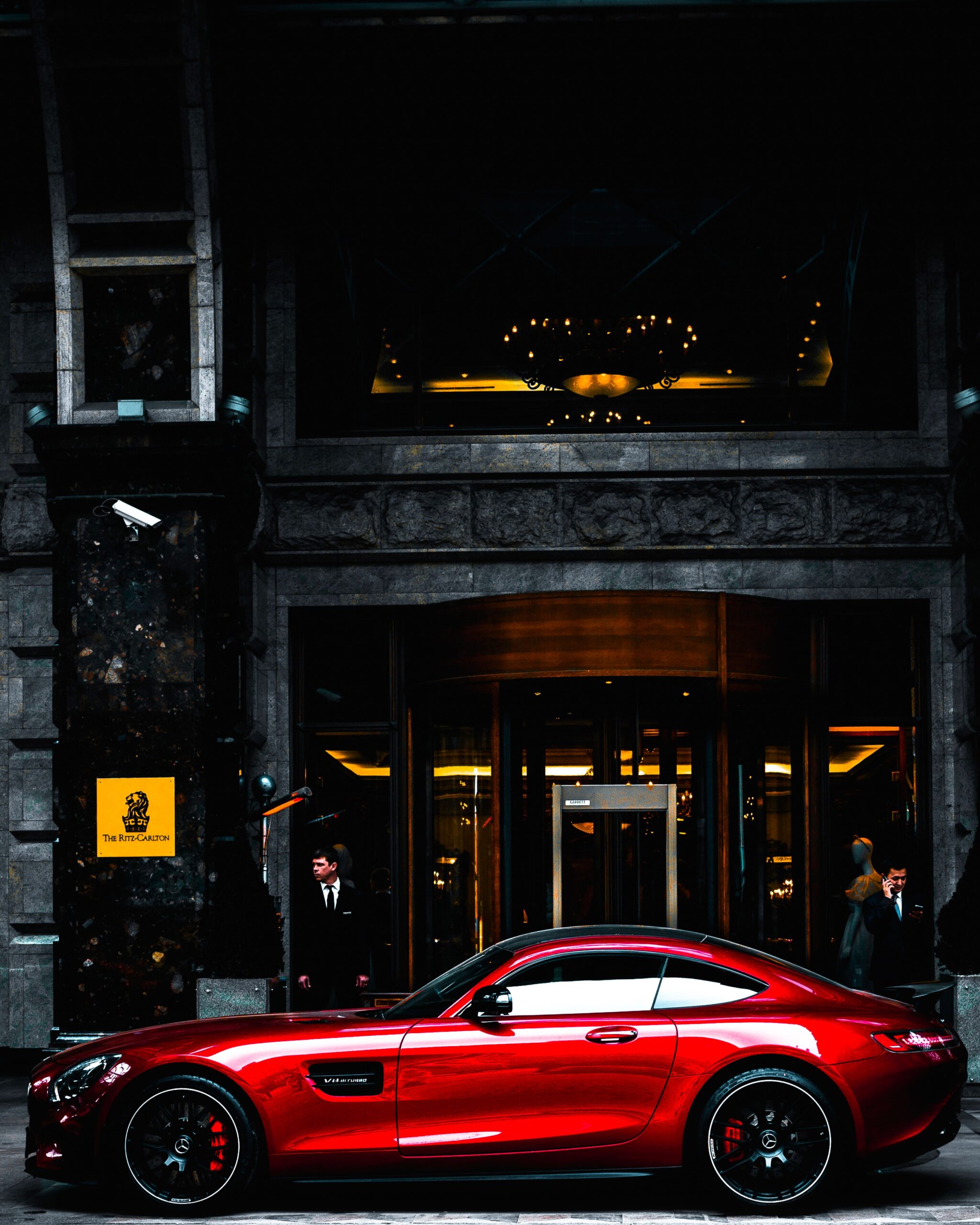
Red
This color often associated with strong emotions such as
- passion,
- love, and
- excitement.
It can also evoke a sense of urgency or danger.
Red has been shown to increase heart rate and stimulate appetite.
Blue
Often linked to feelings of
- calmness,
- serenity, and
- stability.
It has a soothing effect and can promote a sense of trust and reliability.
Blue has been known to lower heart rate and blood pressure.
Shades
Even the shades are so important and makes our life so different and interesting. As we all know from books like the “50 shades of Gray”. Different shades has different associations with different moods, and can associated to different personality types as well just how the author of that book found it out.
Shades of blue
Shades of blue hace different impact on our life too.
For example the color navy blue is typically associated with qualities like
- authority,
- professionalism,
- trustworthiness.
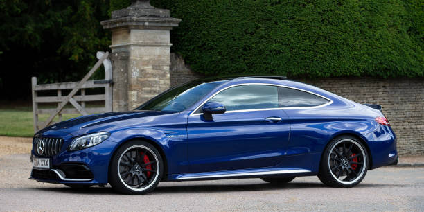
It is often used in uniforms, corporate branding, and formal attire to convey
- a sense of power and
- sophistication.
Yellow
Associated with happiness, optimism, and energy.
It can evoke feelings of warmth and cheerfulness.
Yellow is believed to stimulate mental activity and improve focus.
Green
Commonly associated with nature, growth, and harmony.
It has a calming effect and can evoke feelings of relaxation and balance.
Green is often linked to feelings of rejuvenation and is said to promote overall well-being.
Purple
Often associated with royalty, luxury, and creativity. It can convey a sense of mystery and spirituality. It has been linked to enhanced creativity and inspiration.
Purple was a color that represented
- luxury,
- prestige, and
- regal status in the history.
Emperors, kings, and other high-ranking rulers were often adorned in purple garments as a symbol of their elevated position in society.
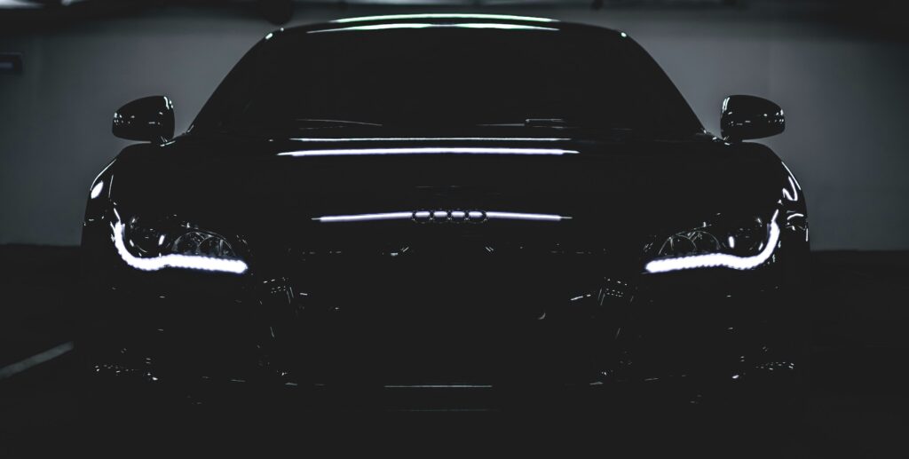
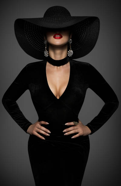
Black
The color black holds various associations and can influence mood in different ways. Emotional effects of black are vary.
Elegance and Sophistication
Black is often associated with sophistication, formality, and elegance.
It can create
- a sense of luxury and refinement,
making it a popular choice for formal occasions or high-end designs just like in that Audi R8 below.
Power and Authority
Black linked to power, authority, and strength.
It can bring a sense of
- seriousness and
- professionalism,
which is why it commonly used in business settings or to symbolize authority figures.
Mystery and Intrigue
Black is often associated with mystery, darkness, and the unknown.
It can evoke
- a sense of intrigue,
- creating a dramatic and mysterious atmosphere.
In creative contexts, black can be used to add depth and intensity to designs.
Intimacy and Depth
Black has the ability to create a
- feeling of depth and
- intimacy in interior spaces.
It can add a sense of coziness and create a visually striking contrast when paired with other colors or textures.
Black can also associated with negative emotions such as sadness, grief, or fear. In some cultural contexts, it may connected to mourning or negative symbolism. These associations can vary depending on cultural backgrounds and personal experiences.
Marketing, branding and design
In various contexts, such as marketing, branding, and design, understanding the emotional responses evoked by colors is crucial.
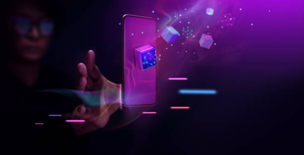
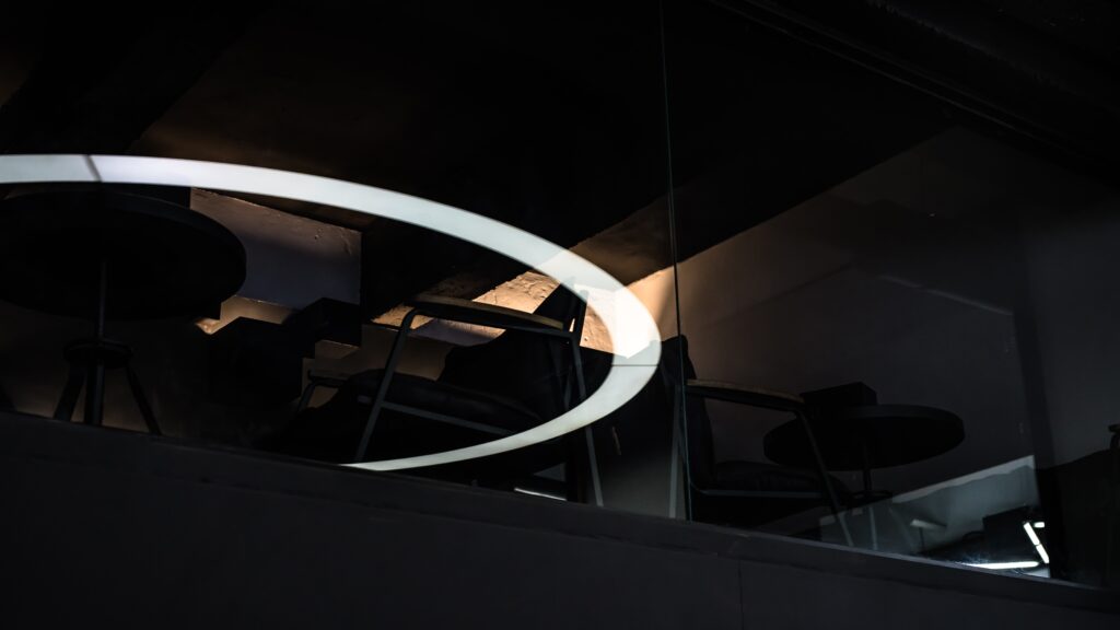
Futuristic Tone and Colors
By strategically incorporating colors that align with the desired emotional impact, businesses and individuals can create compelling visual experiences like what we see in the picture above that resonate with their target audience, convey specific messages, and elicit the intended emotional responses.
Contrast, complementary and analogous colors
- Contrast between colors can create visual interest and help elements stand out.
- Complementary colors (opposite on the color wheel) can create a visually striking effect.
- Analogous colors (adjacent on the color wheel) can create a harmonious and cohesive look.
Moods and perceptions
Influencing mood
Colors can have a huge impact on people.
For instance we can create different feelings with warm and cool colors, just as with bright colors, which elicit feelings of joy, enthusiasm, and liveliness. They can create an energetic and dynamic atmosphere. Pastel colors, such as soft shades of pink, blue, and green, have a gentle and calming effect. Can evoke feelings of relaxation, tenderness, and a sense of harmony. Neutral colors like beige, gray, and white can create a sense of balance, simplicity, and timelessness.
They can provide a calming backdrop and allow other colors or design elements to stand out.
Similar perceptions
Colors even in different marketing, branding and design context can have similar effect on people.
For example in design like interior design it can have similar effect just like in web design, and branding that is why it is important if our profession is more like art related and a bit connected to experiences to know how different colors impact our
- mood,
- balance,
- harmony,
- well-being.
Vibrant and vivid colors
Vibrant and bold colors can grab attention, create a sense of energy and excitement. They are trending again in 2023 and I wrote about them in the Top Interior Design Trends article.
They have the remarkable ability to
- capture attention and
- create a lively and energetic atmosphere.
Just like we can see this in Burano island, which popular from its colorful vibrant houses and glasses.
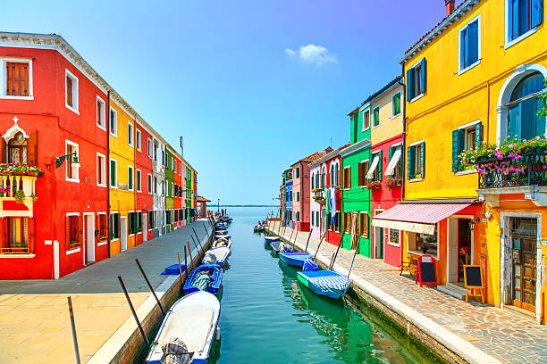
Italy.
Visual presence and experiences
Bold and vibrant colors possess a strong visual presence that naturally draws the eye.
Their intensity and saturation make them stand out in any setting, whether it’s in
- advertising,
- graphic design, or
- even in the physical environment.
These colors have high contrast and tend to create a dynamic and energetic visual experience.
Strategic use
When used strategically, vibrant colors can evoke
- feelings of excitement,
- enthusiasm, and
- vitality.
They have the power to ignite emotions and engage viewers on a deeper level.
These colors often convey
- a sense of passion,
- adventure, and
- creativity,
making them particularly effective when targeting audiences seeking stimulation or a sense of boldness.
Marketing & advertising
Bold colors frequently utilized to
- capture attention and
- make a lasting impression.
They commonly employed in
- logos,
- product packaging,

- promotional materials to create a sense of energy and excitement surrounding a brand or offering.
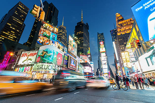
Ads on Times Square. New York City, USA.
Moreover, these colors are often utilized in signage and displays to attract potential customers and guide attention to specific areas.
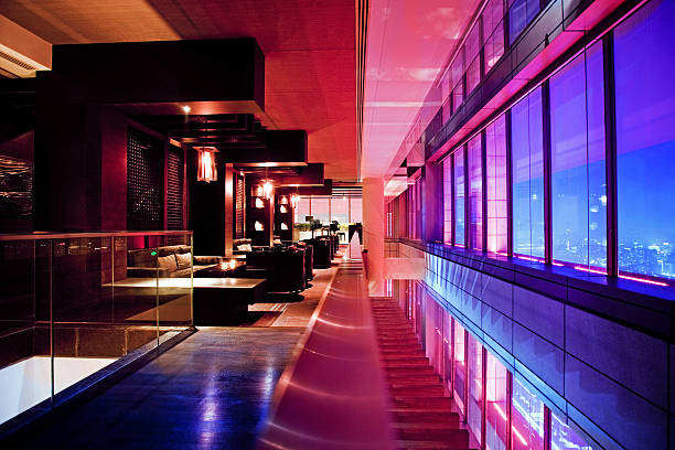
Graphic design
In the realm of graphic design, bold and vibrant colors can infuse a design with a sense of liveliness and impact.
They are frequently used to
- create focal points,
- highlight key elements, or
- convey a specific message.
For instance as you can see in the above picture the use of a limited color palette can create
- a focused and
- cohesive visual identity.
UX/UI design
In addition to this, bold and vibrant colors are popular in website & user interface design, where they can
- enhance user engagement and
- create a memorable browsing experience.
These colors possess the ability to require attention and inject energy into any visual composition.
Their dynamic nature and eye-catching qualities make them a powerful tool for evoking excitement and capturing the imagination of viewers.
Creating visual hierarchy and guiding attention
In design, color can play a crucial role in establishing visual hierarchy by
- using contrasting or
- dominant colors to guide the viewer’s attention.
Let’s consider a web page for an e-commerce website selling shoes. The page consists of a product image, a title, a description, and a “Buy Now” button.
To create hierarchy and guide the viewer’s attention, different colors can be strategically used.
Product Image
Essential element that should capture the viewer’s attention first. To achieve this, the image can be displayed against a white or neutral background, ensuring it stands out visually.
Title
The title of the product should be prominent and instantly readable. To make it stand out, a bold and contrasting color can be used for example
- a deep blue or a vibrant red,
- while the rest of the text remains in a neutral color like black or gray.
Description
Provides additional information about the product.
To establish a visual hierarchy, the description text should be a slightly smaller size and a color that is slightly less intense than the title, ensuring it doesn’t overshadow the title but still attracts attention. For example, a darker shade of the title color or a complementary color.
“Buy Now” Button
A crucial call-to-action button that should be highly visible. To make it stand out, a contrasting color can be used, such as a vibrant green or orange, against a neutral background.
The button should have
- a larger size and
- may also incorporate additional design elements like shadows or gradients to create depth.

By using color strategically in this example, the visual hierarchy is established as follows:
- The product image captures immediate attention,
- followed by the title,
- description, and
- finally, the prominent “Buy Now” button.
The contrasting or dominant colors used for each element help guide the viewer’s attention and emphasize the most important aspects of the design.
However, color alone is not the sole factor in creating hierarchy.
Other design elements such as
- typography,
- size,
- spacing, and
- layout also contribute to the overall visual hierarchy.
A combination of these elements, including color, helps effectively guide the viewer’s attention within a design.
Interior design
Colors play a crucial role in interior design as they have the ability to
- shape the atmosphere,
- evoke emotions, and
- impact the overall experience within a space.
Here are some key aspects to consider when using colors in interiors:
Mood and Ambiance
Colors have the power to set mood and create a desired ambiance in a space.
Warm colors like red, orange, and yellow can promote energy, excitement, and warmth.
Cool colors like blue, green, and purple, on the other hand, can create a sense of calmness, tranquility, and relaxation.
Understanding the intended mood of the space will help in selecting the appropriate color palette.
Space Perception
Colors can influence the perception of space.
Lighter colors tend to make that the room appear larger and more open, while darker can create a sense of coziness and intimacy.
In small rooms, lighter hues are better to give an illusion of spaciousness, while darker shades used effectively in larger spaces.
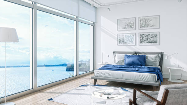
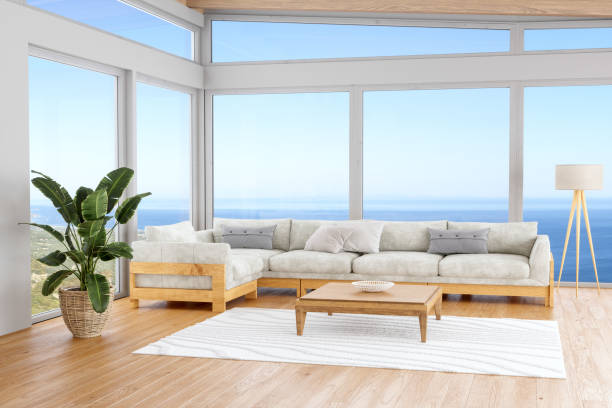
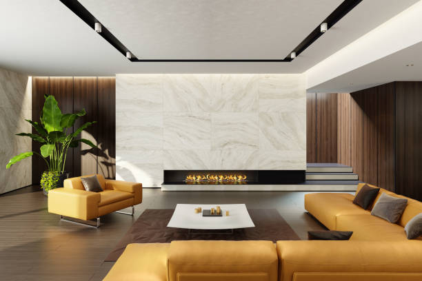
Harmony and Contrast
Creating a harmonious and visually pleasing interior involves understanding color combinations.
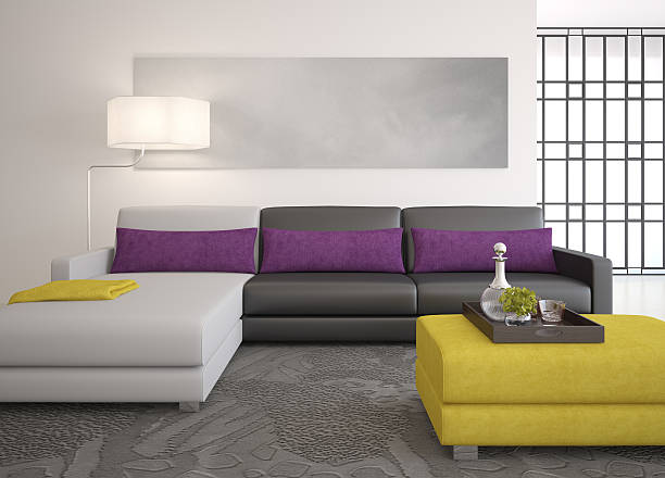
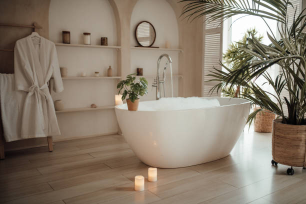
Analogous color schemes use colors that are adjacent to each other on the color wheel and create a sense of harmony. Just like we can see on the below picture.
Complementary color schemes involve colors directly across from each other on the color wheel, provide a high level of contrast and can create a vibrant and dynamic atmosphere.
Examples of complementary color combinations are:
- Red and green.
- Blue and orange.
- Yellow and purple.
- Yellow-green and red-purple.
- Red-orange and blue-green.
Accent Colors
Introducing accent colors can add
- visual interest and
- create focal points within a space.
By strategically incorporating a pop of color in accessories, artwork, or furniture, one can draw attention to specific areas or elements.
Cultural and Psychological Influences
Colors can have cultural and psychological associations. That should be considered in interior design. Different cultures may have unique interpretations and symbolism attached to colors.
White
- Western Culture: purity, innocence, and weddings. Often symbolizes cleanliness and simplicity
- Eastern Culture: In China and Japan: mourning and funerals. It represents death, mourning, and the afterlife.
Red
- Western Culture: passion, love, and energy, can symbolize excitement, strength, and power.
- Eastern Culture: In China, red is highly auspicious color symbolizing good luck, prosperity, and joy; often used in celebrations and traditional ceremonies.
Black
- Western Culture: formality, elegance, and sophistication; symbolize power, authority, mystery.
- Eastern Culture: Associated with mourning and funerals, similar to the association in certain Western cultures. It symbolizes grief, sorrow, and the afterlife.
Yellow
- Western Culture: happiness, optimism, and sunshine; can symbolize joy, warmth, and energy.
- Eastern Culture: Associated with spirituality, wisdom, and royalty; represents power, divinity, and sacredness.
Blue
- Western Culture: calmness, tranquility, and stability; can symbolize trust, reliability, intelligence.
- Eastern Culture: can associated with immortality and spirituality. It represents healing, meditation, and enlightenment.
Green
- Western Culture: nature, growth, freshness, money, and sometimes envy.
- Eastern Cultures: the meaning of green vary. Chinese culture: nature, harmony, good luck. Japanese culture: life, youth, and nature. Islamic culture: paradise and renewal.
In addition to this, individuals have personal experiences and preferences that influence their response to specific colors.
These examples demonstrate how colors hold diverse meanings and interpretations across different cultural contexts. It’s important to be aware of cultural symbolism & interpretations when working with colors in design or when considering their impact in cross-cultural communication.
Functional Considerations
The function of a space should be considered when selecting colors.
For example,
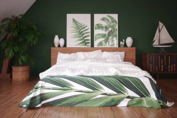
- calming colors like blue,or green may be suitable for bedrooms or relaxation areas,
- while vibrant and energetic colors like yellow or red may work well in areas intended for social interaction or creativity.
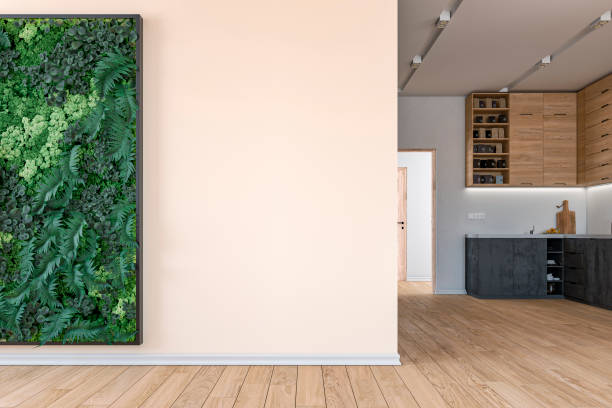
White stone table & Dark wooden floor.
These colors in balance with each other and create a space for social interaction.
The use of colors in interiors is a creative and subjective process, where the desired atmosphere, function, and personal preferences all play a significant role. By carefully selecting and harmonizing colors with the materials, one can transform a space into an environment that aligns with the intended purpose and evokes the desired emotions.
Personal associations and experiences
Personal experiences and associations are vary regarding different colors and shades.
For me personally recently the following colors attract my attention and can not find the reason why but i feel they make me feel so cozy and happy.
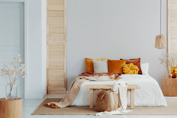
Beige
Often associated with neutrality, simplicity, and warmth.
The harmony of colors.
It creates a sense of calmness and can provide a versatile backdrop for other colors and design elements. Beige is commonly used in interior design to create a timeless and elegant aesthetic.
Pink
Associated with femininity, softness, and romance. It can evoke feelings of tenderness, nurturing, and playfulness. Pink can be playful and contrasting if we mix it up with shades of blue.
Pink is commonly used in spaces intended for relaxation or to create a gentle and inviting atmosphere.
Rose Gold
A warm and luxurious color associated with elegance, sophistication, and glamour.
It can add a touch of opulence and refinement to an interior or any acceessory think about your phone case or purse. Rose gold accents and finishes are often used in contemporary and upscale designs.
Sand
The reminiscent of natural elements and can evoke feelings of serenity, tranquility, and a connection to the outdoors. It creates a warm and earthy ambiance and people using often in beach-inspired or coastal-themed interiors.
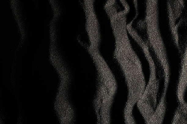
Especially black sand dunes posters with top view can show a sense of luxury on modern walls.
Pale Beige Shades
These shades are gentle and soothing, often associated with subtlety, simplicity, and understated elegance.
These shades can provide a neutral and calming base, allowing other elements in the space to stand out. They are commonly used in minimalist or Scandinavian design styles.
With green elements
Beige and green combine to form an earthy and natural palette, reflecting harmony with the environment and sustainability, while pink and green create a soothing ambiance, representing organic beauty and a connection to nature.
Rose gold and green blend luxury with eco-consciousness for a sophisticated aesthetic, meanwhile sand and green evoke a calming, grounded atmosphere reminiscent of serene natural landscapes.
Beige shades with green create a balanced and sustainable palette, symbolizing
- simplicity,
- purity, and
- a commitment to eco-friendly living.
Sustainable look of design
Beige shades with brown and green can create a sustainable look of design as you can see on the
Go Green Sustainable Design Shop,
where you can find products which part of the circular economy and support sustainability fully.
Green represents nature and brings freshness and tranquility, while beige provides warmth and elegance. Blue adds depth and stability, symbolizing serenity & the vastness of the sea and sky.
Beige and blue colors combined create a calming and nature-inspired color scheme.
Together, these colors evoke a sense of peacefulness and connection to the environment. This color combination is ideal for creating soothing spaces, such as
- bedrooms or
- living rooms, where relaxation and tranquility are desired.
Picture sources: Adobe stock, Shutterstock, Unsplash, Pixabay, Pexels, Wikipedia, AI etc.